Lesson 6: Mobile Optimization for Product Images
Introduction
In the era of smartphones, mobile optimization is no longer a luxury but a necessity, especially for online businesses like Shopify stores. A significant part of this optimization process involves tailoring your product images for mobile viewing. This lesson will delve into the importance of image sizes, screen sizes, and how to select and compose product images with a mobile-first approach.
The Mobile-First Approach to Product Images
The mobile-first approach is a design strategy that prioritizes the creation and optimization of content for mobile devices and then scales it up for larger screens. For Shopify store owners, this means selecting and arranging product images in a way that they look appealing and clear on smaller screens.
When choosing product images, keep in mind that mobile users will be viewing them on a much smaller screen. This means that images with a lot of detail may not be as effective because these details may be lost or hard to see on smaller screens. Instead, focus on images that highlight the main features of the product.
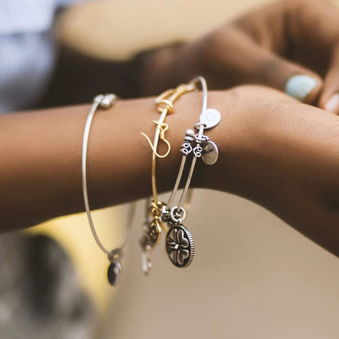
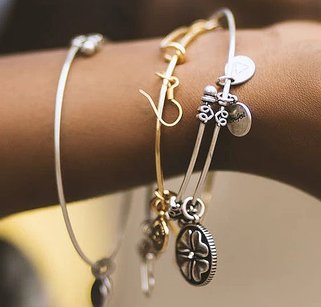
For instance, if you’re selling a piece of jewelry, instead of using a wide shot that includes the entire piece with a lot of background, consider a closer, more focused shot that highlights the details of the jewelry. This way, even on a small screen, the main selling points of the product are clear and visible.
Balancing Image Size and Screen Size
Image size, in terms of dimensions and file size, plays a crucial role in mobile optimization. The dimensions of an image (its width and height in pixels) should align with the screen size of the device it’s being viewed on. For mobile devices, this is typically between 320px and 500px wide.
Note that Shopify will automatically resize your images for mobile devices so your focus here should be a maximum image size of 1000 x 1000 for desktop with optimal composition for mobile viewing.
Larger image dimensions often mean larger file sizes, which can slow down page load times and consume more data. This is where image compression comes into play. Image compression reduces the file size of an image, often without noticeably reducing its quality. Formats like JPEG are particularly good for this, as they offer high compression rates.
Image Composition for Mobile Viewing
When composing your product images, consider how they’ll appear on a mobile device. Ensure that the main focus of the product is easily identifiable. Avoid cluttered backgrounds or unnecessary details that could distract from the product when viewed on a smaller screen.
Remember, on a smaller screen, every pixel counts. Make sure each one is contributing to a better understanding and appreciation of your product.
Image composition examples:


Conclusion
Mobile optimization for product images on Shopify is a vital aspect of your online store’s success.
By understanding the relationship between image sizes and screen sizes, and by adopting a mobile-first approach to image selection and composition, you can ensure that your product images are effective across all devices.
The goal is to provide your customers with a seamless and enjoyable shopping experience, whether they’re browsing on a desktop or a mobile device.
Any Questions: Ask for help in the forums and quote, “Lesson 6: Mobile Optimization for Product Images”